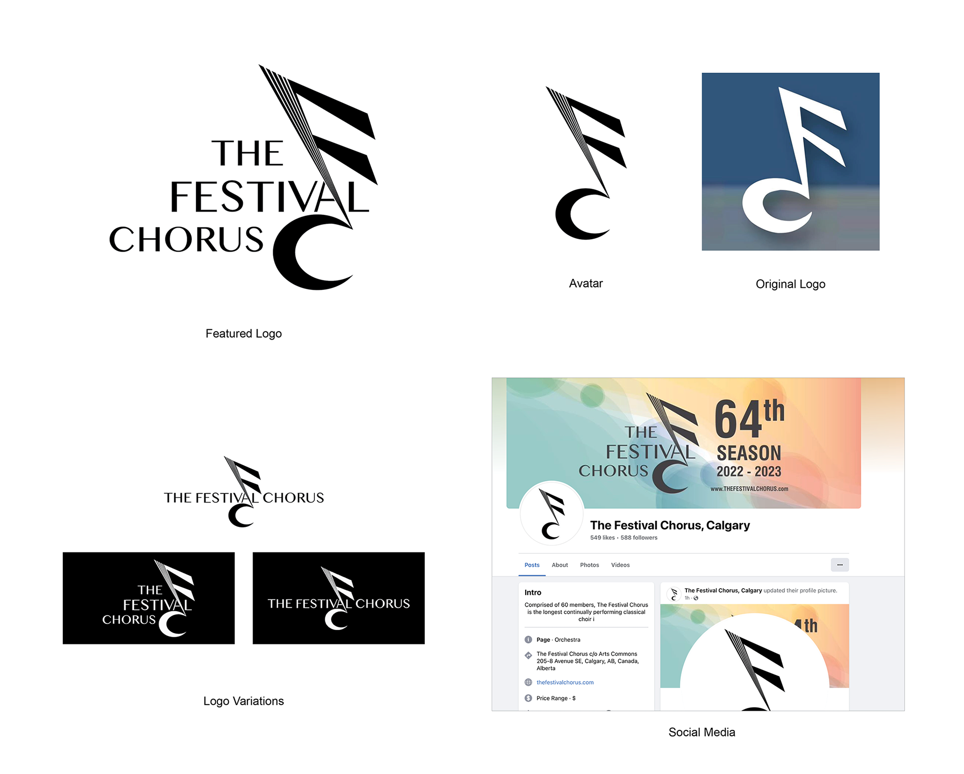
The Festival Chorus
Logo Design
"The Festival Chorus of Calgary was formed in 1958 producing high quality choral concerts every year".
The client, The Festival Chorus, a long standing arts organization, was in need of a long-overdue logo refresh. They wanted to keep it simple with an obvious progression to an updated look.
The older logo was an icon that fused the letters F and C to form a musical 16th note. There was no other elements to this logo outside of the icon. I was tasked to update the look, and add the name of the organization creating stand-alone logo. The requested colour was just black.
Staying with the original idea of the "F" and "C" joined musical 16th note, I added visual interest to the main shaft of the "F" by splitting it into six radiating lines representing the six vocal ranges of the chorus: Soprano, Mezzo Soprano, Alto, Tenor, Baritone, and Bass. The slant of the icon is more sharp and pronounced with cleaner lines to achieve a modern and dynamic feel. Finally the Chorus name was added joining the "A" in festival to the radiating shaft of the "F"–intertwining the icon and the name to form the full logo.
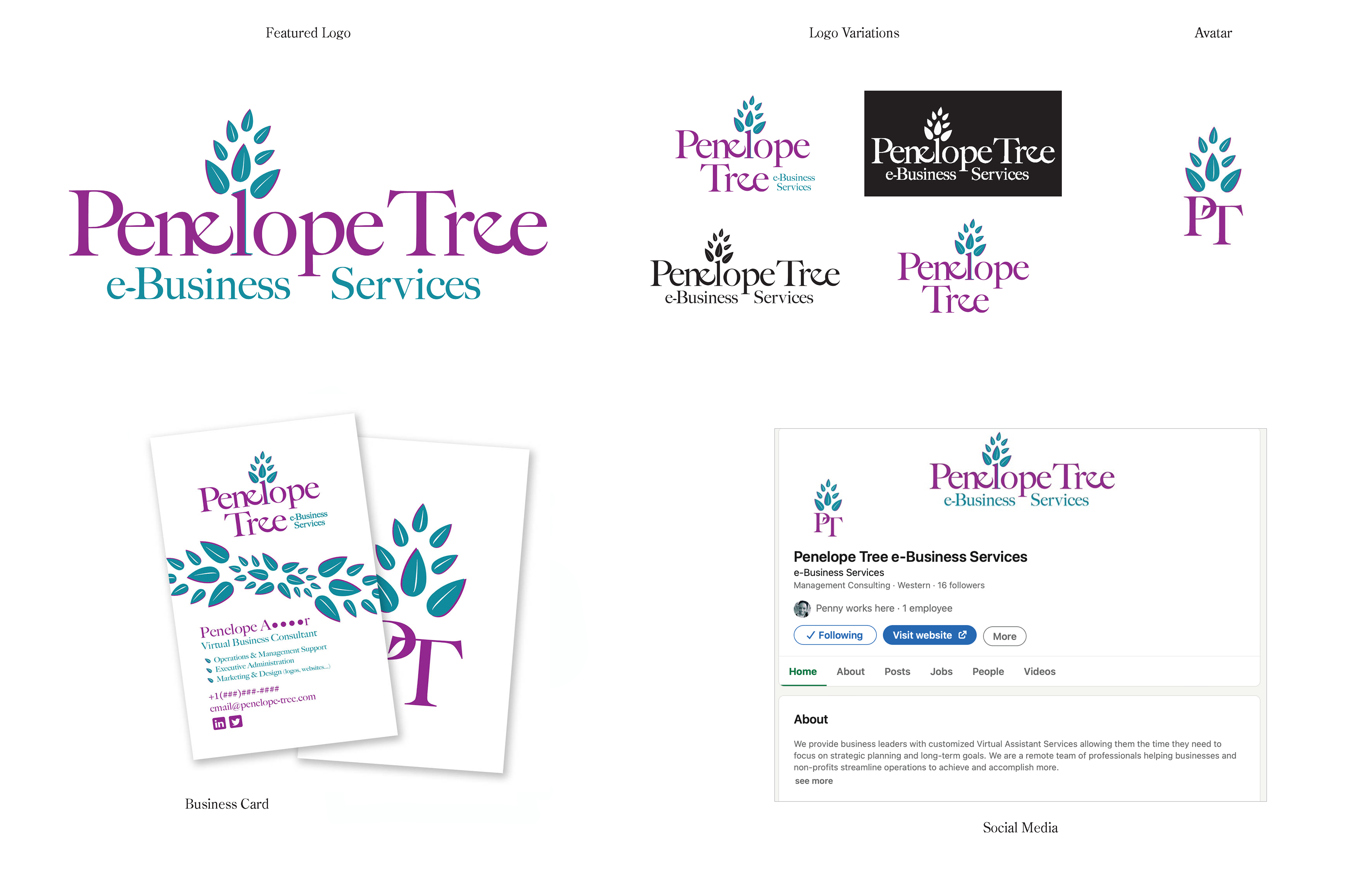
Penelope Tree e-Business Services
Logo Design | Brand & Identity
"We provide business leaders with customized Virtual Assistant Services allowing them the time they need to focus on strategic planning and long-term goals. We are a remote team of professionals helping businesses and non-profits streamline operations to achieve and accomplish more".
The client, Penelope, came to me with the name "Penelope Tree," and an idea for a business with unlimited growth potential.
With a name like Penelope Tree, the first go-to would be a tree design if we were going down the literal interpretation route, but this wasn't an arborist or florist business, it was something very different.
After talking to Penelope about her business model, the idea of branching out and growing her services to accommodate her client's needs as they grew was a constant theme. She spoke about adding value and building upon bespoke services to each individual client; her being the central support as her team grew.
Everything she spoke about could be illustrated in the structure of a tree, with Penelope as the main trunk being the support for all services branching out from her core skills and expertise.
The logo organically emerged as a logotype of the name with the "L" being the tree trunk with stylized leaves branching out. We added the tagline "eBusiness Services" to further cement what the business was providing. The colours teal and purple are simply Penelope's favourite colours, and since this business is all about her skills and expertise–it all just fit.

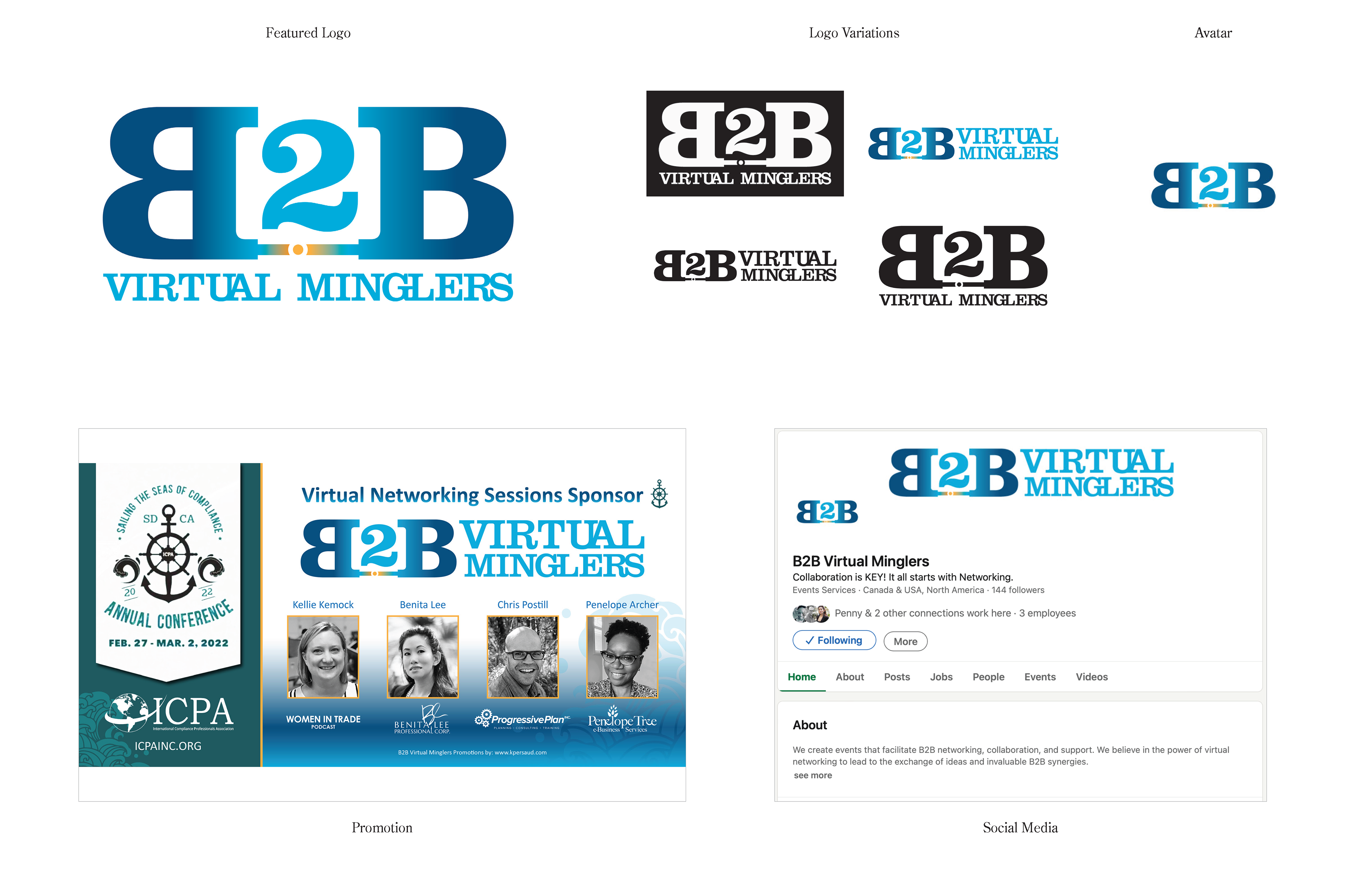
B2B Virtual Minglers
Logo Design | Brand & Identity
"The B2B Virtual Minglers bring the power of networking to entrepreneurs, small businesses, organizations, and individuals interested in gathering virtually–to facilitate the exchange of ideas, valuable insights, and B2B collaborations".
The client wanted a bold logo that was clear and concise to what they were all about.
Business-to-business (B2B) is a common and widely known phrase in the business world, and it's the basis of what this group is all about. So having this prominently displayed was key to this design. Coupled with the words "Virtual Minglers" this logo is all about clarity at first glance.
The two B's representing separate business entities are connected with a tube carrying a glowing orb traveling from one business to another–illustrating the exchange of ideas and insights.
As it passes from one "B" to another it illuminates the "2" signifying collaboration between the two. The glowing orb and tube is also a dual illustration of a wire and datum transfer, representing the virtual (online) nature of the mingles (networking events).
The colour blue is associated with trust, honesty, and business. Yellow-Orange is a complementary colour of blue and is associated with sparks, flames, and illumination–representing ideas and knowledge.